Application Overview
Overview
Application Performance Management (APM) is a critical process for ensuring your applications run efficiently and effectively. The MIddleware’s APM dashboard is a powerful tool that provides real-time insights into the performance of your applications. It helps you identify and resolve issues before they impact the end users.
APM Dashboard
The middleware’s APM dashboard is a powerful tool for monitoring and optimizing the performance of your applications. The dashboard provides real-time insights into the application’s usage patterns, response times, and success and error rates, enabling you to identify and resolve issues quickly and efficiently. leverage the different graphs in the APM dashboard, including Traces, Latency, Success, and Errors,


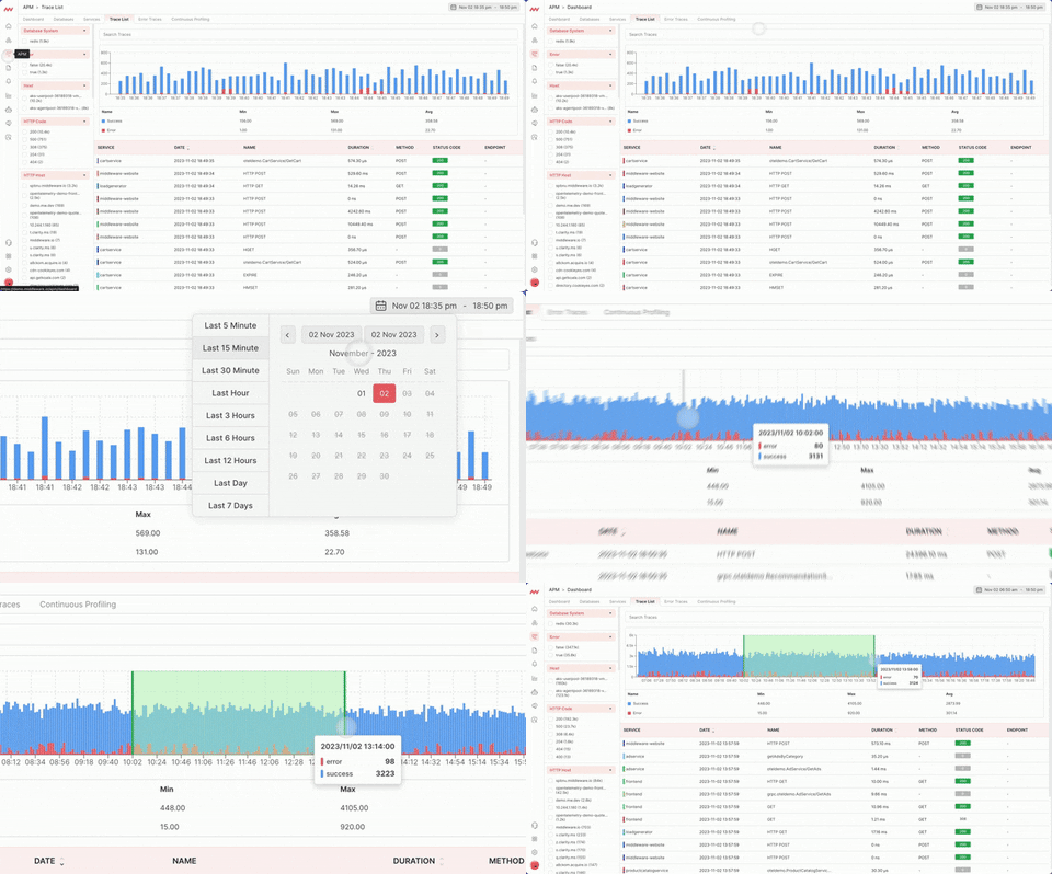
We have the time range selector is a feature in the APM dashboard that allows you to choose the specific time period you want to view the application’s performance data. This feature is essential because it enables you to analyze trends in your application’s performance over a specific period, such as minutes, hours, days, weeks, or months.
The scale of success vs error in traces
The scale of success vs. error in traces is a graphical representation of the percentage of successful requests versus those with errors. This feature allows you to see how often your application is experiencing errors compared to successful requests. A high number of errors could indicate a problem with your application’s code or infrastructure, and you can use this data to troubleshoot and fix the issues.
APM summarized data

Number of requests, number of successes, number of errors:
The number of requests, successes, and error is a vital feature of the APM dashboard. It shows the total number of requests made to your application, the number of successful requests, and the number of requests that failed. This data helps you identify trends and patterns in your application’s usage, such as peak hours and user behavior.
Max Latency:
Max latency is the maximum time it takes for a request to complete successfully. This feature allows you to track the worst-case scenario for the response time of your application. By identifying the maximum latency, you can set thresholds for your application’s response time, ensuring that it meets the required performance standards.
P75 Latency:
The P75 latency is the 75th percentile of the response time for a particular request. It represents the amount of time that 75% of requests took to complete successfully. This feature helps you understand the overall performance of your application, as it shows the response time that most requests experience.
P99 Latency:
The P99 latency is the 99th percentile of the response time for a particular request. It represents the amount of time that 99% of requests took to complete successfully. This feature is critical because it helps you identify outliers in your application’s performance. By analyzing the response time for the slowest 1% of requests, you can identify and address the root causes of performance issues.
Trace Analysis

The Traces graph displays the number of hits in the selected range time vs hits. It is a graphical representation of the traffic that your application is receiving. This graph helps you to identify the peak usage periods, track changes in usage patterns, and monitor your application’s load. You can use this graph to identify the root cause of performance issues and optimize the application accordingly.
Latency Analysis

The Latency graph displays the time vs p50, p75, p95, and p99 latency graph. It represents the response time of the application in different percentiles. The p50 latency is the median response time, the p75 latency represents the response time for the 75th percentile of requests, the p95 latency represents the response time for the 95th percentile of requests, and the p99 latency represents the response time for the 99th percentile of requests. By monitoring the latency graph, you can identify the slowest transactions, optimize the application’s performance, and ensure that your application meets the required performance standards.
Success Trace Analysis

The Success graph displays the number of successful hits in the selected range time vs success hits. It is a graphical representation of the successful transactions in your application. This graph helps you to monitor the overall health of your application and identify any changes in the success rate. You can use this graph to track the performance of your application and identify any issues that might affect the user experience.
Error Trace Analysis

The Errors graph displays the number of error hits in the selected range time vs error hits. It is a graphical representation of the failed transactions in your application. This graph helps you to monitor the overall health of your application and identify any changes in the error rate. You can use this graph to track the performance of your application and identify any issues that might affect the user experience.


Was this page helpful?
